Introduction
Sometimes, inspiration can be found in the simplest places. Two of my watercolour paintings were inspired by the quiet beauty of everyday life, the repeating patterns on my water bottle. What began as a casual observation turned into flowing shapes and soft washes of colour, echoing the rhythm of those designs. Through watercolour’s gentle transparency, I wanted to capture how ordinary patterns can transform into something fluid, meditative, and alive on paper. Here I will show you how it all came together.
Process description
This watercolour piece began with a simple spark of inspiration: the repeating floral patterns on my water bottle. Using the Giorgione Aquarelle pencil set, I set out to translate those delicate motifs into a layered watercolour drawing. I started by carefully sketching the petals, matching the palette as closely as possible to the reference design. For the petals, I chose deep reds, soft pinks, and purples, layering them to create contrast and dimension. To soften the edges, I added light pink along the outer petals, giving a sense of gradient and depth.
Moving to the center of the flower, I blended pinks, yellows, and light orange tones, building up the warm core of the bloom. To define its structure, I traced the stamens — the fine details radiating from the center — with a dark pen, emphasizing how the flower seems to expand outward with energy.
The colours of the flower shift from pink to red, yellow to cream, and I paid close attention to capturing those subtle transitions, layering them so that the final form feels vibrant and true to life.
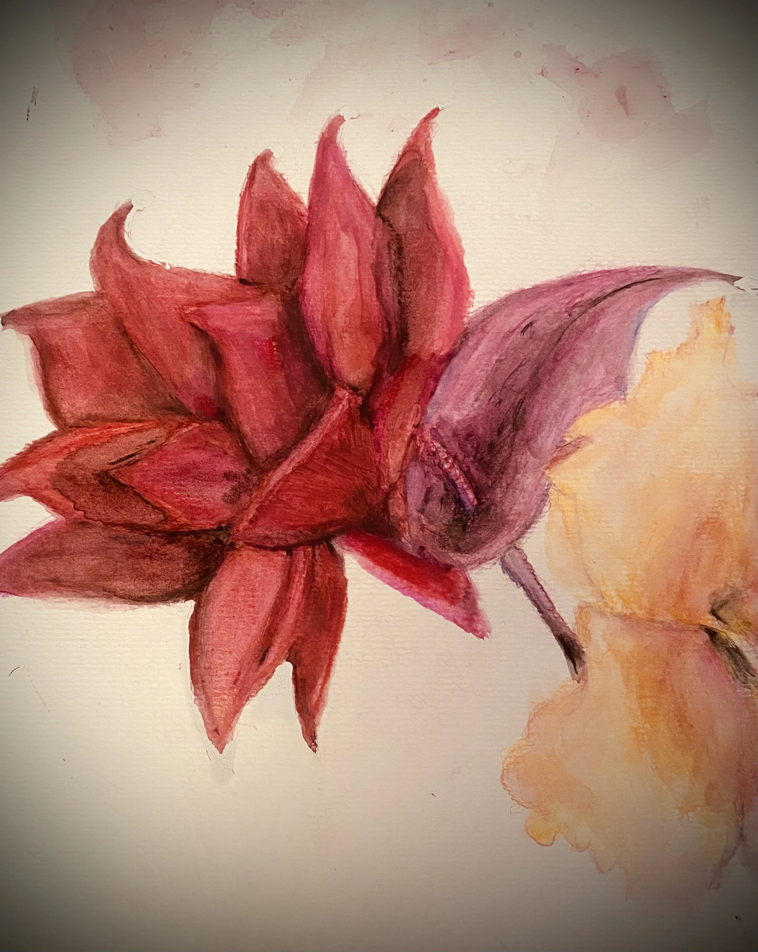
Once the colours were fully in place, I took the aquarelle brush, dipped lightly in water, and began to blend. Following the natural movement of each petal and leaf, I softened the pencil marks, letting the pigments flow into one another. This stage transformed the drawing from flat colour into a more realistic, fluid watercolour, while still retaining the layered contrasts beneath.
After completing the first layers, I noticed that some petals leaned too far toward purple. To bring the colour back into balance, I deepened the petals with a darker red, brushing over them to blend the hues and create a richer, more natural tone. I also added a bit of black and pink on the surroundings to make it stand out more

Water bottle art

First layer of colour

Second layer of colour
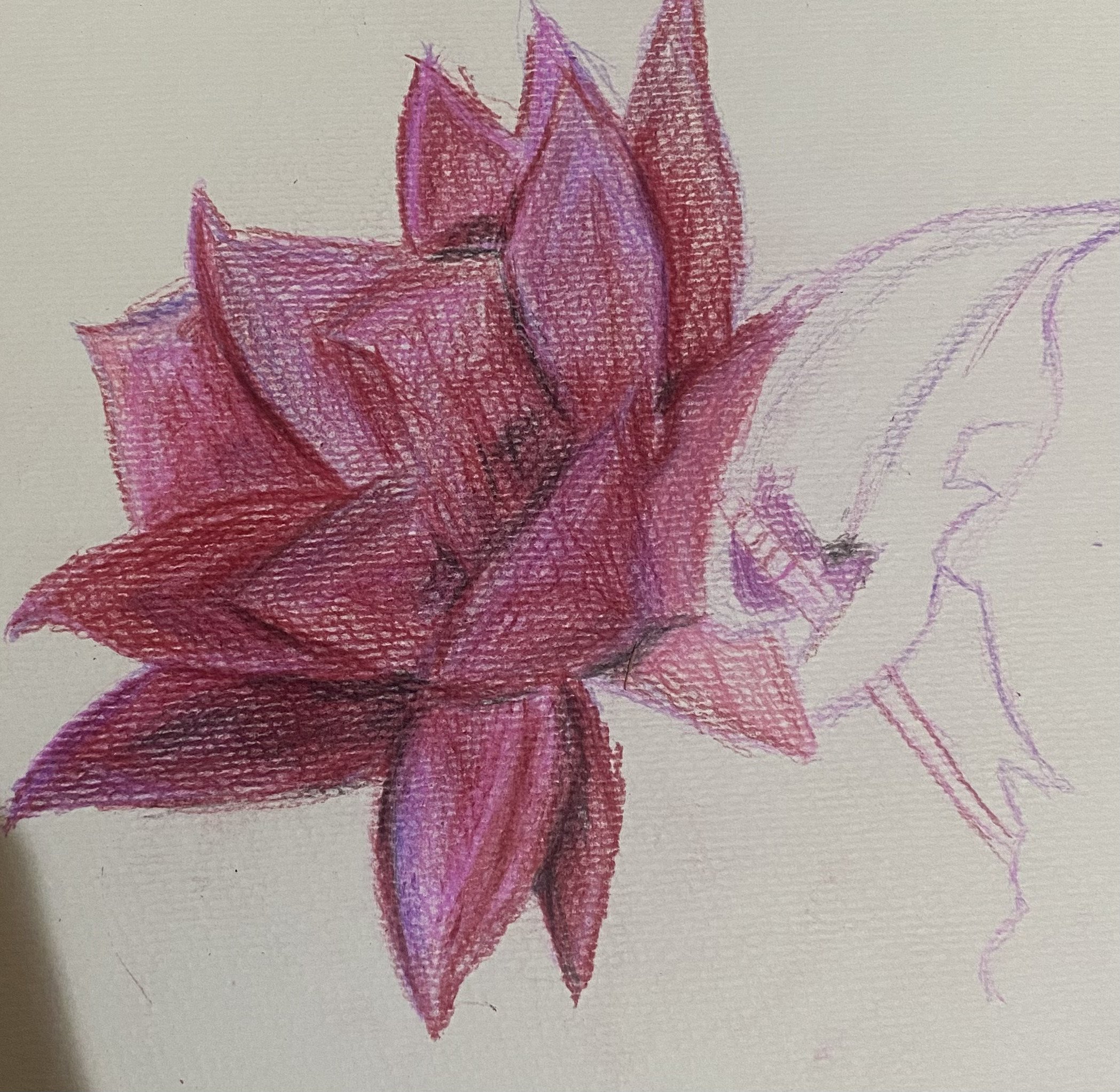
Third layer of colour with pink and purple to highlight petals
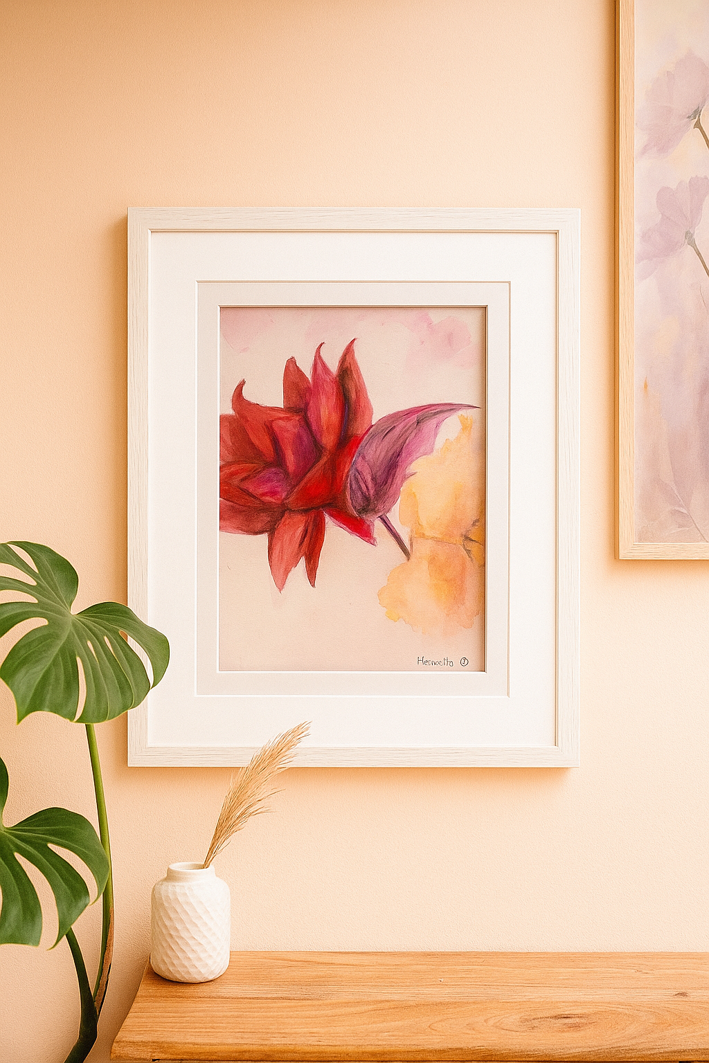
High-quality reproductions of this watercolour painting are available in my shop. You can choose from prints, framed editions, postcards, or digital downloads — each carefully made to reflect the vibrant layers and details of the original. However you prefer to enjoy it, this piece is ready to bring a touch of colour and inspiration into your space.

Petals fully layered, flower loading

Finished paining with watercolours pigments blended